I regularly point out problems with physical buttons. Physical buttons help visualize the conceptual problems behind buttons on websites, without the distractions of technology.
Today’s example comes courtesy of a minivan I rented in Texas. As a car, it was fine. As a UX platform, it was full of reused visual elements with different actions.
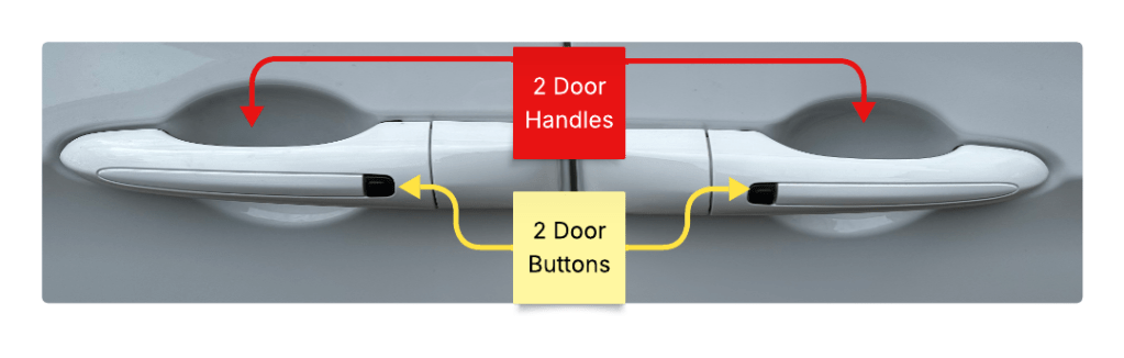
As an example, here is a closeup of the door panel.

This looks like pretty standard door stuff. Two doors, two handles, two buttons.
The front set (right side) performs like most other car door handles.
Sometimes the door button will toggle lock state, sometimes it only locks the doors. Likewise, some door handles will automatically unlock the car, and others will only allow you to open the door if the car is unlocked.

Pretty standard stuff.
The rear set of controls is for the minivan’s sliding door. They work entirely differently.

The sliding door is automatic. The handle and the button both engage the mechanism.
If you pull the handle, you should then let go, because the car door will open itself. The handle is also a toggle, if the door is open and you pull the handle, the door will close. At no time should you use human muscle to open or close the door. This is different from the front door, which requires human muscle to both open and close.
The rear button is also a door open and close toggle. While the front button performs an idempotent “lock only” action, pressing the rear button will always change the state of the door.
Same Element, Multiple Actions
There are 2 buttons that look the same, are placed the same, and do different things. The 2 handles also look the same, are placed the same and do different things.
The sliding door handle is redundant, it does the same thing as the button. It also introduces a major point of failure because it invites humans to use muscle against a self powered mechanism. To illustrate the fragility, I took a minivan taxi home after leaving Texas and the driver shouted not to touch the door handle. He explained that people pull hard on the handle and break the door mechanism.
Design Failures And Standard Resolutions
In summary there are 2 design failures here:
- Using the same visual element to do different actions. When buttons and handles do different things, they should look different.
- Using a design that encourages users to do the wrong thing. All door handles, except minivan sliding doors, are meant to open doors by pulling. Since the sliding door doesn’t want people to pull hard, it shouldn’t use a standard door handle.
Pushing My Buttons
After a few mistakes I stopped opening the sliding door when I meant to lock the car. I stopped using the sliding door handle entirely. I quickly learned the UX, but I never escaped the extra friction. My eyes would still lock onto the buttons and I would have to think about what they did before taking action.
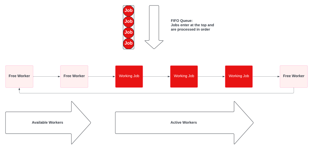
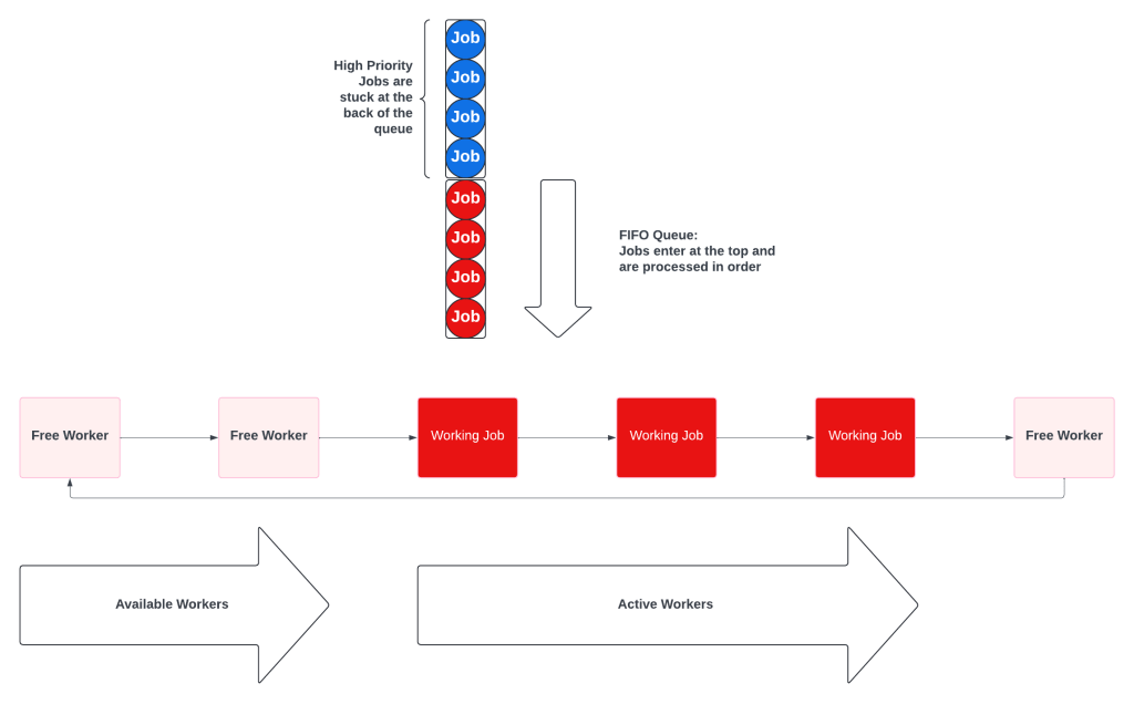
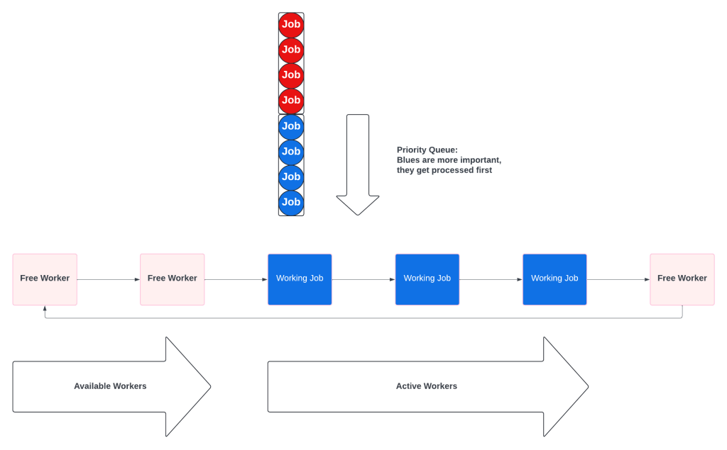
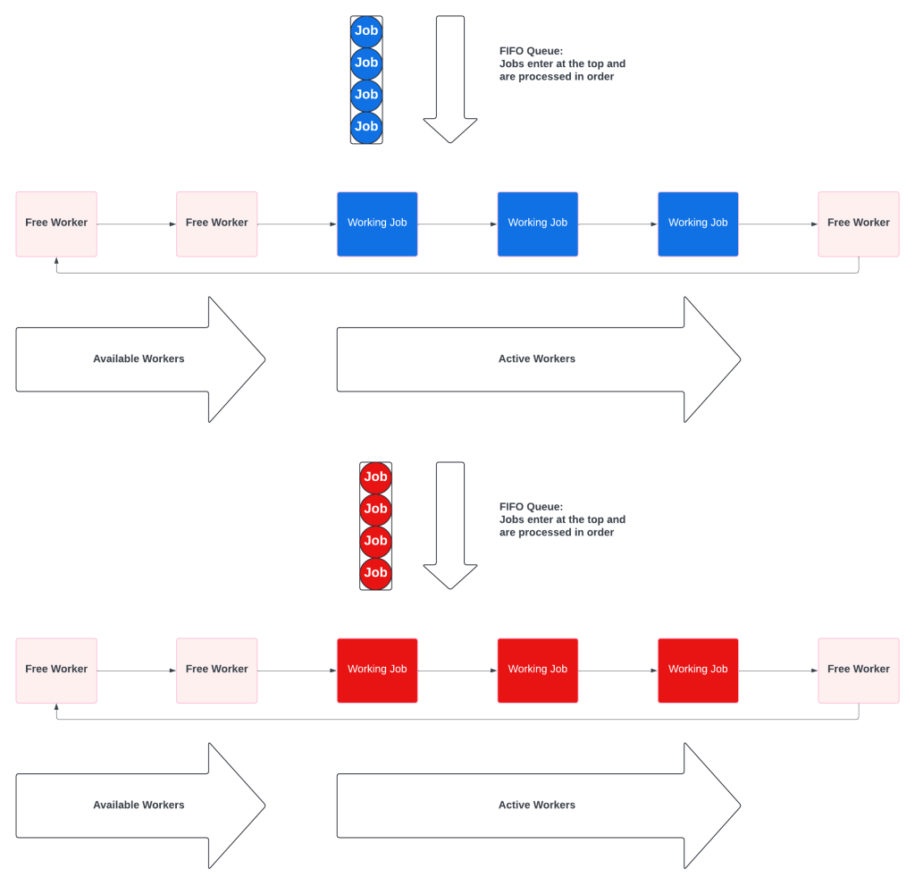
Like the minivan, UIs are littered with inconsistent buttons, multiple ways to do the same thing, and the ability to do “the wrong thing” because your expectations don’t match what the designer was thinking. Users will learn the system, but the extra friction will never disappear.